3.1 Build components
In this lesson you'll learn how to build components that you will later add to your models as part of basic and modular component fields.
#Overview
In this step of our Getting Started tutorial, you'll learn about components, what they can be used for, and how to configure & use them.
 Components
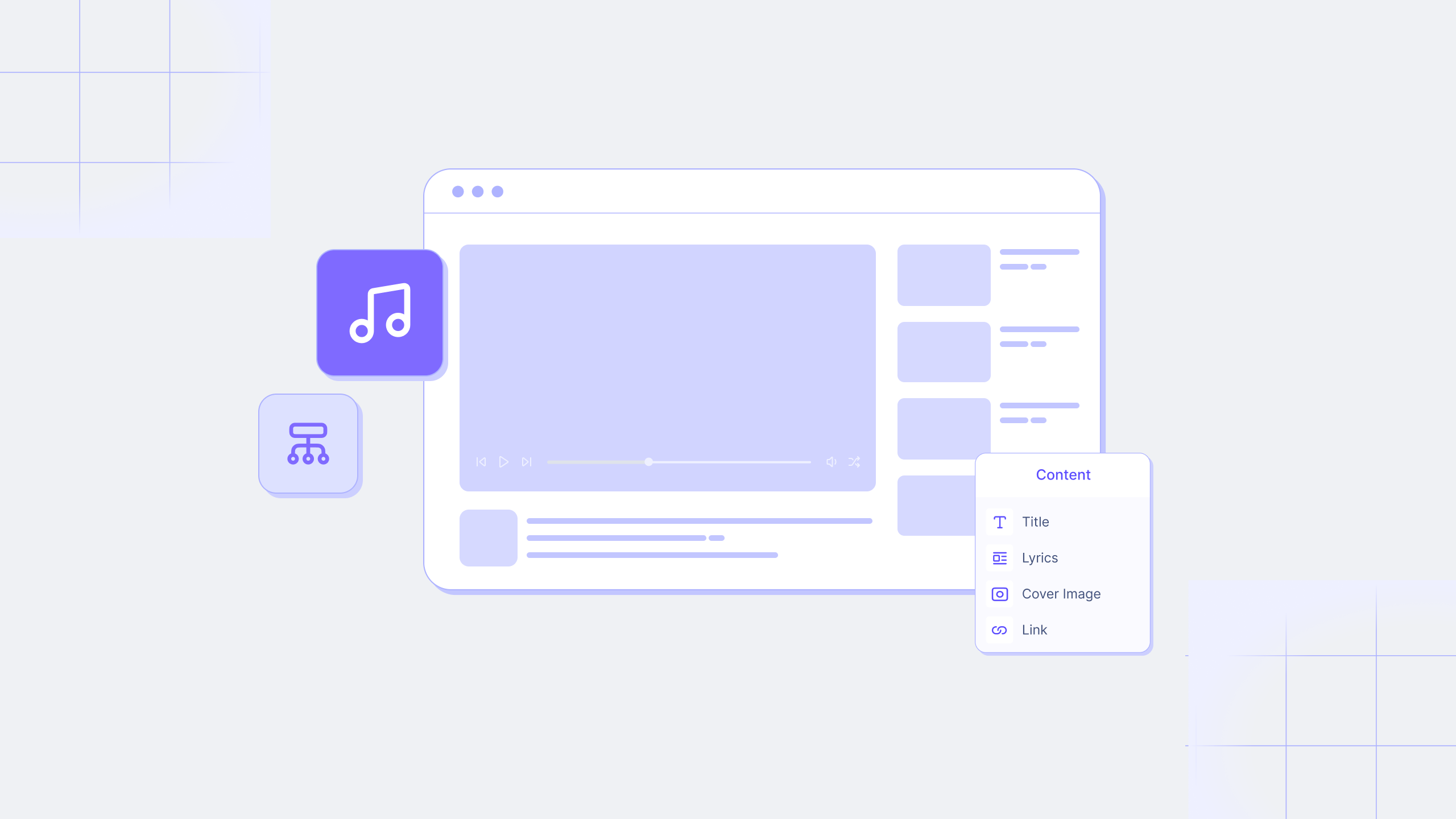
A component is a pre-defined set of fields that can be reused across models and content entries. Think of a component as a flexible, reusable template where you define the fields once, then fill them with different content every time you use it in a content entry.
Using components as templates in your schema saves time and declutters the content creation screen.
They are created at the schema builder level and are then available to be added as basic or modular component fields to your models. Basic component fields will contain a single component, while modular component fields may contain more than one. Both can allow multiple values.
You add fields to them in the same way that you would to a model, and then that entire set of fields can be added to a model through a single component field.
For instance, our e-commerce project could use a basic component field to add a section in the content editor where users listing products for sale may add related products. The component field would contain a “Related products” title and a number of references where the user can select other product entries to be shown as related.
It could also have a “product type” modular field component that allows users to get a different set of fields to complete depending on the product sold. For instance, you need size & color options for clothes, but not necessarily for food.
This makes it possible to have a single product model that can accommodate many different product types while keeping the completion of specific fields as required. This also means that the number of fields shown on the content creation screen is reduced, as certain fields will only display if needed, making it easier to create content entries.
Let's build our components.
#Building our components
We are going to build six different components:
- A related products component that we can later add as a basic component field to our Product model, which will enable us to add related products to a Product page through references.
- Four more, for clothing, shoes, accessories, and decor, which we can later use as part of a modular component for product variants.
- A product variants component that will allow us to select which information we will add to an entry according to product type.
- A Call to Action so that customers can leave comments.
- A button that we'll use as part of our CTA.
- A product grid component to display our goods.
#Related products
We want our product pages to showcase related products. An easy way to build this is by creating a component containing a reference field that will allow us to relate multiple products.
In the Schema builder, let's click on the +Add button by Components on the left sidebar to open the Add component page. Add the following information, then click on Add Component:
| Field | Input |
|---|---|
| Display Name | Related Products |
| API ID | RelatedProduct |
| Plural API ID | RelatedProducts |
Our component has been created, but it's empty. Let's add a Single line text field to it. We'll use the following information:
| Tab | Field | Input |
|---|---|---|
| Settings | Display name | Title |
| Settings | Use as title field | Select checkbox |
| Validations | Make field required | Select checkbox. This will make the title field required every time we use the component. |
| Advanced | Set initial value | Select checkbox, and add “Related products” to the Initial value text field. |
| Advanced | Field visibility | Use the dropdown to select Read only. This ensures that the initial value we set in the previous field cannot be edited. |
We can now save the field.
Now we should add a way for the related products to be linked. To do this, we'll revisit the topic of references like we mentioned we would a couple of lessons back. We will relate our products through a Reference field, which we'll add from the right sidebar.
We'll use the following information:
| Screen section | Field | Input |
|---|---|---|
| Define relationship | Reference type | Select Allow only one model to be referenced because we only want to be able to add other products here. |
| Define relationship | Model to reference | Use the dropdown to select the Product model. |
| Define relationship | Reference directions | Select One-way reference. |
| Define relationship | Reference directions | Select the Allow multiple Products per RelatedProduct checkbox. This creates a one-to-many reference, which will then allow us to add multiple related products to a product entry. Click Continue to move on. |
| Configure reference | Display name | Products |
| Configure reference | API ID | products |
| Configure reference | Description | "Add 4 related products here" |
| Configure reference | Field visibility | Read / Write |
Finally, click Add to save this field into the component.
Your component should look something like this:
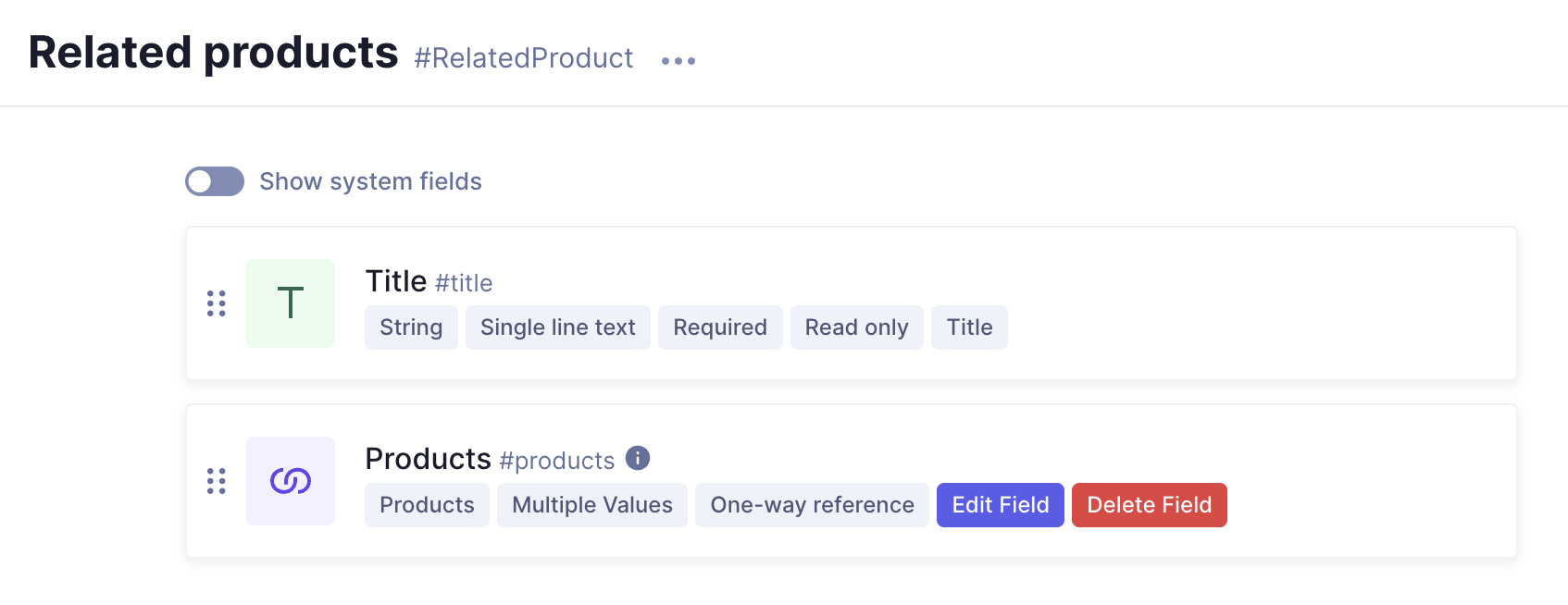 Your finished component
#Product type
To publish effective product listings on our e-commerce, we need to ensure certain fields are required to avoid incomplete information that could confuse potential customers.
Since our online shop sells different product types, not all products will share the same characteristics. For instance, shoes & clothes don't use the same sizes. If we make both size dropdowns required, then we won't be able to save that entry without providing a size for clothing and shoes for the same product, which does not make much sense.
However, if we don't make this information required, we might end up with incomplete product listings being published.
A simple way to sort this out is by creating separate components for our product types, each with its own set of required fields. These will be four components - Shoes, Clothing, Accessories, and Decor - and they will not be added to the Product model directly but as part of a modular component field nested into a component called Product variant later on.
This will allow us to create product entries where we can select a product type with a pre-defined set of required fields. For this, we will be using some of the enumerations that we created in the previous lesson.
Let's start working on our components. We'll add them in the same way that we added the Related products component before. Let's do the first one together. We'll click on +Add next to Components and fill in the following information:
Clothing component
| Field | Input |
|---|---|
| Display Name | Clothing |
| API ID | Clothing |
| Plural API ID | ClothingItems |
Now that we have our first component, let's add fields to it:
We'll find the Dropdown field on the right sidebar and click on it to add it. We'll use the following information:
| Tab | Field | Input |
|---|---|---|
| Settings | Display name | Size |
| Settings | API ID | This field is autocompleted when you type in a display name. Leave it as it is. |
| Settings | Enumeration | Use the dropdown to select Clothes size |
| Validations | Make field required | Select checkbox |
We can now save the field.
We will also add a Dropdown field from the right sidebar for item color selection. We'll use the following information:
| Tab | Field | Input |
|---|---|---|
| Settings | Display name | Color |
| Settings | Enumeration | Use the dropdown to select Wearable items color |
| Validations | Make field required | Select checkbox |
Our clothing component should look like this:
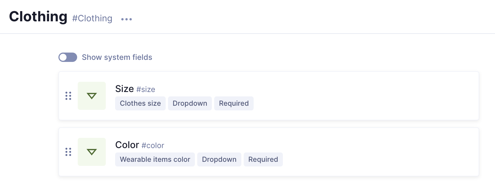 Clothing component
You'll do the same for shoes, wearables and decor, using the following information:
Shoes component
| Field | Input |
|---|---|
| Display Name | Shoes |
| API ID | Shoe |
| Plural API ID | Shoes |
Just like with the previous component, add a Dropdown field from the right sidebar. We'll use the following information:
| Tab | Field | Input |
|---|---|---|
| Settings | Display name | Size |
| Settings | Enumeration | Use the dropdown to select Shoes size |
| Validations | Make field required | Select checkbox |
We can now save the field.
We'll add another Dropdown field for item color selection. We'll use the following information:
| Tab | Field | Input |
|---|---|---|
| Settings | Display name | Color |
| Settings | Enumeration | Use the dropdown to select Wearable items color |
| Validations | Make field required | Select checkbox |
Our shoes component should look like this:
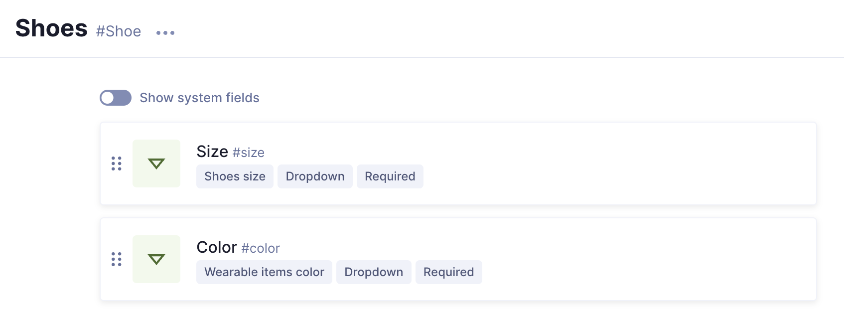 Shoes component
Accessories component
| Field | Input |
|---|---|
| Display Name | Accessories |
| API ID | Accessory |
| Plural API ID | Accessories |
Here, we'll also add a Dropdown field from the right sidebar. We'll use the following information:
| Tab | Field | Input |
|---|---|---|
| Settings | Display name | Color |
| Settings | Enumeration | Use the dropdown to select Wearable items color |
| Validations | Make field required | Select checkbox |
After saving, the component should look like this:
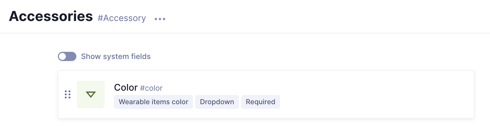 Accessories component
Decor component
| Field | Input |
|---|---|
| Display Name | Decor |
| API ID | Decor |
| Plural API ID | DecorItems |
For decor, we'll add a Dropdown field from the right sidebar, using the following information:
| Tab | Field | Input |
|---|---|---|
| Settings | Display name | Color |
| Settings | Enumeration | Use the dropdown to select Decor items color |
| Validations | Make field required | Select checkbox |
After saving, the component should look like this:
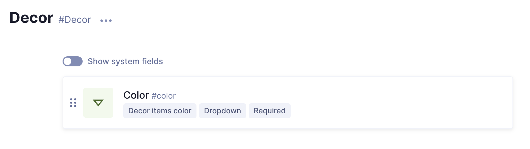 Decor component
#Product Variant
Now that our wearables and decor components have been created, let's create the Product Variant component. This is the component that will let us select a product type, which will reveal all fields that must be completed for our product selection when we work on an entry.
Click +Add next to Components once again, and fill in the following information:
| Field | Input |
|---|---|
| Display Name | Product Variant |
| API ID | ProductVariant |
| Plural API ID | ProductVariants |
After clicking Add, it's time to add fields to our component.
In this case, we want our content entry to offer us the possibility to select a product type. To achieve this, we'll add a Modular component field nested inside this component, which will contain the four product type components that we created earlier.
Select the Modular component field from the right sidebar, and complete it with the following information:
| Field | Input |
|---|---|
| Display Name | Product type |
| API ID | productType |
| Description | Select the product type to reveal fields |
| Select allowed components | Use the dropdown to select Clothing, Shoes, Accessories, and Decor |
Click Add to save your component.
This is what your Product variant component should look like:
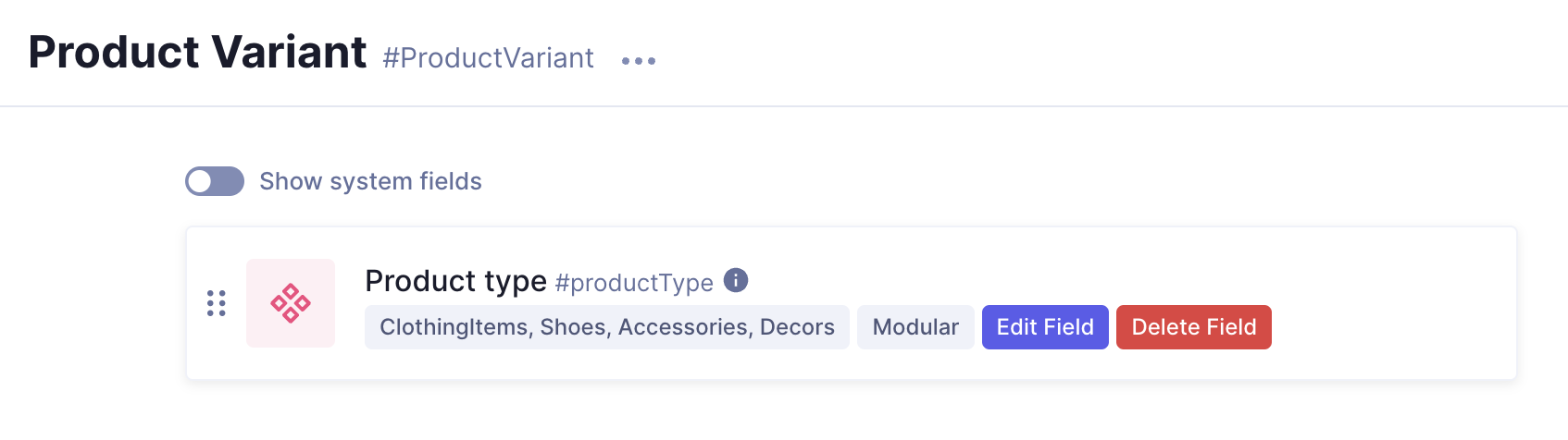 Product variant component
#Button
Let's also create a component for a simple button. Click +Add next to Components once again, and fill in the following information:
| Field | Input |
|---|---|
| Display Name | Button |
| API ID | Button |
| Plural API ID | Buttons |
After saving the component, we need to add text and a URL to our button. To do this, we'll start by adding a Single line text field to it, using the following information:
| Tab | Field | Input |
|---|---|---|
| Settings | Display name | Text |
| Settings | Localize field | Select checkbox |
We can now save the field.
Next, we'll add a Slug field from the right sidebar. We'll use the following information to create it:
| Tab | Field | Input |
|---|---|---|
| Settings | Display name | URL |
| Validations | Match a specific pattern | Select checkbox and select URL from the dropdown. Leave the regex by default as is. |
| Validations | Custom error message | Input value does not match the expected format. |
We can now save the field.
Your Button component should look like this:
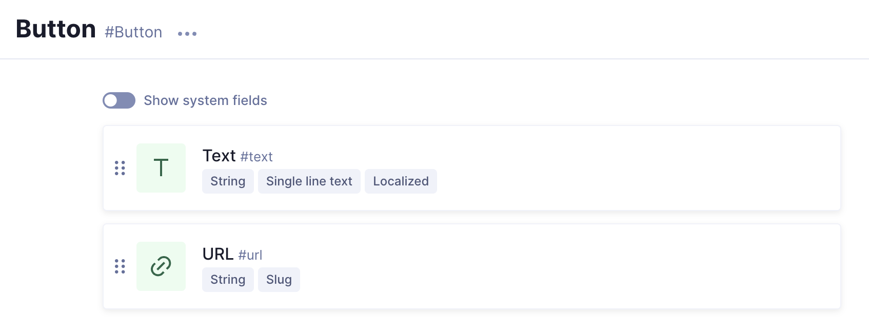 Button component
We will add this button to our Call to Action component in the next step.
#CTA
To create our Call to Action component, click +Add next to Components once again, and fill in the following information:
| Field | Input |
|---|---|
| Display Name | Call to Action |
| API ID | CallToAction |
| Plural API ID | CallToActions |
After saving the component, we can start adding the fields once again.
We'll start by adding a heading. To do this, well select the Single line text field from the right sidebar. We'll use the following information:
| Tab | Field | Input |
|---|---|---|
| Settings | Display name | Heading |
| Settings | Localize field | Select checkbox |
We can now save the field.
For the body of our CTA, we want to add a Rich Text editor so we can add a description. In order to do this, we'll select the Rich Text field from the right sidebar, and use the following information to create it:
| Tab | Field | Input |
|---|---|---|
| Settings | Display name | Body |
| Settings | Localize field | Select checkbox |
We can now save the field.
Next, we want our CTA to have an image, so we'll add an Asset picker field from the right sidebar. We'll use the following information:
| Tab | Field | Input |
|---|---|---|
| Settings | Display name | Image |
Finally, we'll add the button component that we created in the previous step. Since we will be adding a single component to this field, we'll select a Basic component field from the right sidebar and create it using the following information:
| Field | Input |
|---|---|
| Display Name | Button |
| Select component | Use the dropdown to select the Button component |
We can now save the field.
Your CTA component should look like this:
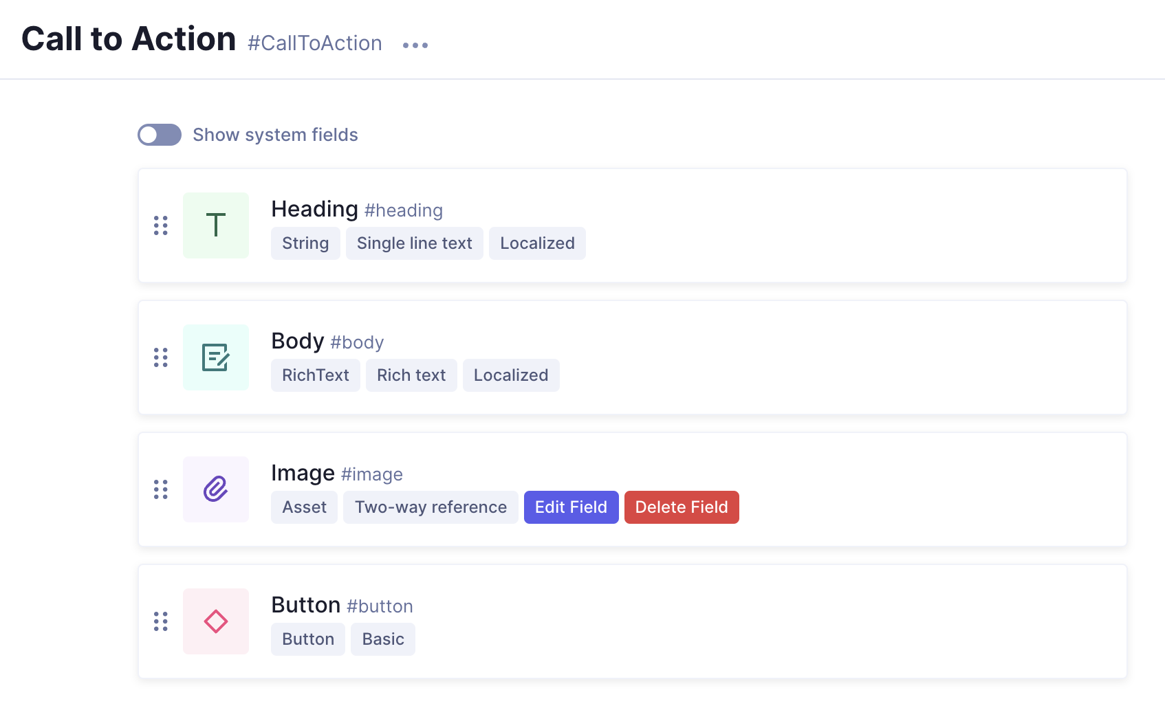 CTA component
#Product Grid
Our final component is a product grid. We want it to have a headline, a description, and to reference the Product model.
To create our Product Grid component, click +Add next to Components once again, and fill in the following information:
| Field | Input |
|---|---|
| Display Name | Product Grid |
| API ID | ProductGrid |
| Plural API ID | ProductGrids |
After saving the component, we can start adding fields to it.
For the headline, we'll add a Single line text field. We'll use the following information:
| Tab | Field | Input |
|---|---|---|
| Settings | Display name | Headline |
| Settings | Localize field | Select checkbox |
We can now save the field.
For the description, we'll add a Rich Text field. We'll use the following information:
| Tab | Field | Input |
|---|---|---|
| Settings | Display name | Description |
We can now save the field.
Finally, we'll add a Reference field. Like we did for our Related products component. We'll use the following information:
| Screen section | Field | Input |
|---|---|---|
| Define relationship | Reference type | Select Allow only one model to be referenced because we only want to be able to add other products here. |
| Define relationship | Model to reference | Use the dropdown to select the Product model. |
| Define relationship | Reference directions | Select One-way reference. |
| Define relationship | Reference directions | Select the Allow multiple Products per ProductGrid checkbox. This creates a one-to-many reference, which will then allow us to add multiple related products to a product grid. Click Continue to move on. |
| Configure reference | Display name | Products |
| Configure reference | API ID | products |
| Configure reference | Field visibility | Read / Write |
Click Add to save this field into the component.
Your component should look something like this:
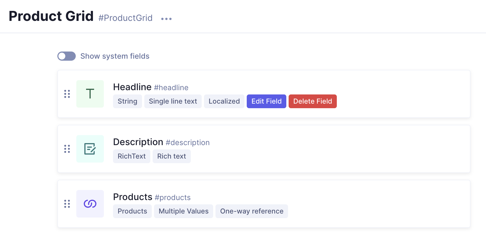 Product grid component
#Included in the project
#SEO
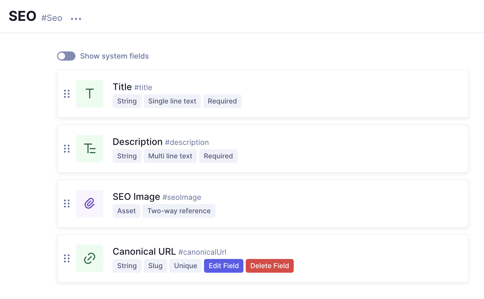 SEO component fields
SEO stands for “search engine optimization”, and it's used to improve discoverability by helping pages rank higher in search engines.
We've included this component in our project from the start. We will be adding it to several models to illustrate SEO good practices, but we won't use it during the tutorial.
The Component contains the following fields:
- Title: This is the name of our component
- Description: This is the description of our component
- SEO image: This is a cover image that is properly named, sized, compressed, has clear AltText, and is the best file type for SEO optimization.
- Canonical URL: A canonical URL is the URL of the best representative page from a group of duplicate pages, according to Google. Leaving blank means it's the default URL of the page.
#Link
The project includes a Link component from the start. This component is meant to be used in the Navigation model, which is also included in the project.
This component is very simple and contains the following fields:
- Display text: Display text for the link in the website navigation.
- External URL: External URL for the website navigation.
We will be introducing a modification here. This model still needs a Reference field that will allow us to link it to some of our other models.
This field could not be originally included in the project, because it relates to content models that we created in previous lessons. This is a great example of how our schema is built in layers, as we needed to create the models before we could relate them.
We'll use the following information:
| Screen section | Field | Input |
|---|---|---|
| Define relationship | Reference type | Select Allow multiple models to be referenced because we want to be able to relate multiple models. |
| Define relationship | Model to reference | Use the dropdown to select the select Blog post, Landing page, and Product models. |
| Define relationship | Reference directions | Select One-way reference, so content can only be queried from this side. |
| Define relationship | Relation cardinality | Select To one and click Continue to configure the reference. |
| Configure reference | Display name | Page |
| Configure reference | API ID | page |
| Configure reference | Field visibility | Read / Write |
Finally, we'll click Add to save our Reference field. We'll see that it's been added at the bottom. Let's use the six-dots handlebar to move it upwards, under the Display Text field.
Your finished Link component should look something like this:
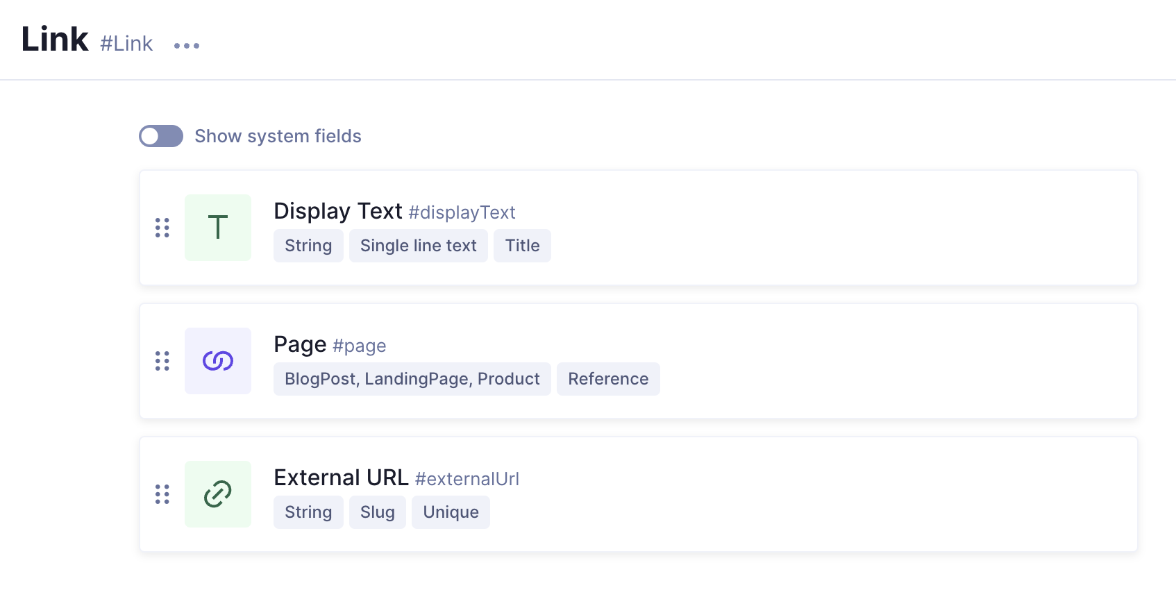 Link component field
Once you've created all components, move on to our next lesson:
3.2 Add components to your models